This Colorful Map Illustrates Where Boston’s Immigrants Live
Eric Levenson, Boston, September 9, 2015
East Boston, Franklin Park, and Mattapan are a bundle of blue, Chinatown is thick with green, and purple decorates the western part of Dorchester in this fascinating, color-filled map of immigrant populations in Boston.
The interactive dot map is the creation of TCU assistant professor Kyle Walker, who used demographic data from the 2009-2013 American Community Survey and the U.S. Census.
Each color represents an immigrant’s native region: blue for Latin America, green for East/Southeast Asia, orange for Europe, and so on. A dot represents about 20 immigrants in that given area.
{snip}
With those colors in mind, we picked out a few notable migration patterns in Boston and in the rest of Massachusetts. You can see the full map here.
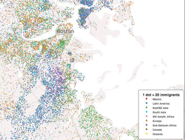
There’s plenty to note here, including the heavy blue Latin American population in the southern parts of Boston, including Mattapan, Franklin Park, and parts of Dorchester.
East Boston, located just northeast of the “Boston” label on the map, is densely colored and largely blue for its Latin American immigrants. About half of East Boston’s population is foreign born, the highest percentage of all Boston neighborhoods, according to the Boston Redevelopment Authority, and a majority of those immigrants come from Colombia and El Salvador.
Cambridge, located just to the northwest, is thick with European immigrants (orange) as well as sprinklings of South Asian (teal) and East/Southeast Asian (green). That green is also pronounced in Chinatown and in Quincy to the southeast.
{snip}