Amazing Graphic Shows Chicago’s Middle Class Disappear Before Your Eyes
John Dodge, CBS Chicago, April 3, 2014
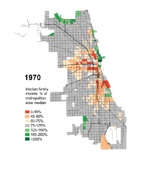
The graphic that you are about to see is sobering, perhaps depressing, and you can’t take your eyes off it.
We have the exhaustive work of Daniel Kay Hertz, a masters student at the University Of Chicago’s Harris School of Public Policy, to thank for that.
{snip}
Watch as the grey squares, which illustrate the middle class that dominated the most of the city’s neighborhoods in 1970s, quickly vanish over 40 years.
The poor, represented by the orange and red colors, explode across the map.
And watch what happens in the green areas representing the upper middle class and wealthy. Not surprisingly, it spreads from downtown to the north side, but not with the same ferocity as the reds and oranges.
Especially in 2000, the greens–the color of money–grow much darker. It seems the rich simply got richer. In later years, the wealthy pushed the poor out of the near West Side. It appears that area bypassed the middle.
The data comes from the U.S. Census.
In his blog, Hertz says he fears that the often-told story of segregation and income inequality in Chicago has led to apathy.
{snip}
[Editor’s Note: In 1970, Chicago was 65 percent white and 33 percent black. By 2010, Chicago was 32 percent white, 33 percent black, and 29 percent Hispanic.]