The Incredible Interactive Map That Plots the Racial Profile of Every Individual Living in America
Steve Robson, Daily Mail (London), August 23, 2013
With 308,745,538 coloured dots, this is the incredible interactive map that plots the racial profile of every single person living in the United States of America.
The remarkable resource was created by University of Virginia professor Dustin Cable, using data collected from the 2010 Census.
Cable allocated colours for each race; blue for people who identify themselves as white, green for black people, red for Asian, orange for Hispanic and brown for those those who identify themselves as from another race, Native American, or multiracial.
The result makes for fascinating viewing. For example, looking at an entire city, it may give the impression of being a cultural melting point. Red and blue dots mix to make purple, while green and blue make teal.
But zoom in further and the segregation between races becomes more apparent. White, black or Hispanic neighbourhoods are clearly visible.
Cable, a senior research associate at the Weldon Cooper Center for Public Service, said the map gives users a level of engagement with Census data which simply isn’t possible from scrolling through hundreds and hundreds of tables.
‘I wanted to create a visual of 2010 census data at a level of granularity not typically seen in many data maps,’ he told MailOnline.
‘And I think it is that level of detail that makes the map, and the data behind it, more accessible for people because, after all, you are one of the 308 million dots on the map. You can look yourself up and place yourself in the context of your neighborhood, city, or region.’
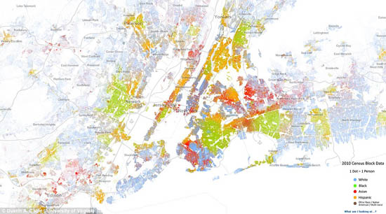
Zoomed-in map of New York City.
[Editor’s Note: The full, interactive map is available here.]