The Geography of U.S. Hate, Mapped Using Twitter
Matt Peckham, Time, May 20, 2013
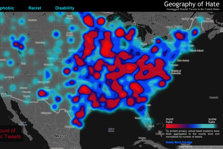
Skim the zoomed-out surface of Humboldt State University’s alarming “Hate Map,” and you’ll encounter angry clouds of bright red framed by smears of gloomy blue, as if some giant freak storm were raining down hell across the U.S.
What you’re looking at is actually a map created by pairing Google’s Maps API with a hailstorm of homophobic, racist and other prejudicial tweets. It’s part of a project overseen by Humboldt State University professor Monica Stephens, who, along with a team of undergraduate researchers, wanted to test for geographic relationships to hate speech.
Above the map, the words homophobic, racist and disability define alternate “hate storm” views, each describing a range of highly offensive terms. Click on the keywords or any of their subcategories and the map shifts, the splotches reorganizing to reflect occurrences of the selected term: bright red areas describe the “most hate,” while light blue ones describe “some hate.”
{snip}
What can the map tell us about hate speech in the U.S.? That’s where this gets tricky. Cycling through all of the views, you might conclude that racists, homophobes and the disability-bigoted plague the country from the Midwest to the East Coast (or that, conversely, things are fairly quiet from the Rockies to the Pacific). But as Stephens herself notes, “Even when normalized, many of the slurs included in our analysis display little meaningful spatial distribution,” and as she later tweeted, “in the East Coast the counties are smaller, so if a word is used in adjacent counties it appears as a hot spot,” which accounts for some of the East Coast–West Coast disparity.
{snip}
Click the image to view an interactive version.