Mapping the Rising Tide
Atlantic Centurion, August 9, 2016
{snip}
Below are some maps I have created from the 2010 US Census, and a subsequent 2011 report issued by the Census Bureau. These official federal documents contain two crucial data sets: 1.) the percentage of the officially-termed non-Hispanic white population in each state, and 2.) the percentage of births to non-Hispanic white couples. N.b. I strongly prefer to use the term Anglo-American to refer to English-speaking White Americans over non-Hispanic White, though here I will use the term Anglo White for obvious clarity.
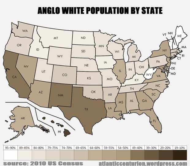
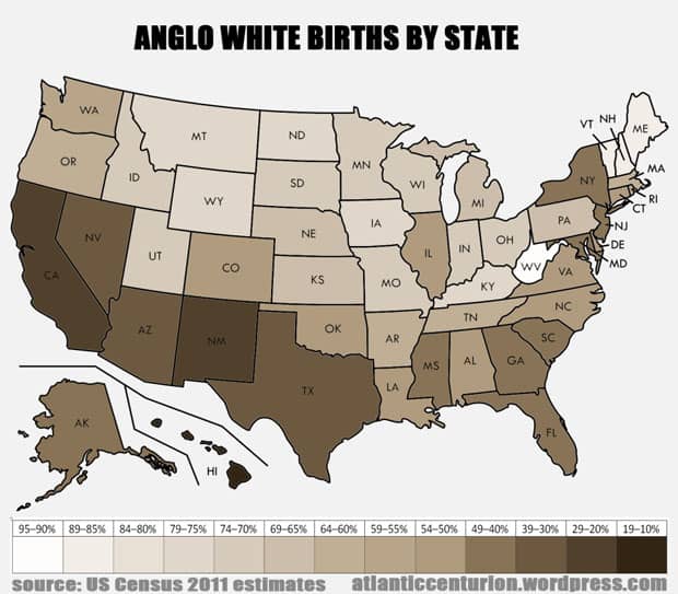
This is the White population of each state. As you can see, the interior of the country is obviously more European than the coasts, the Southwest, and the black belt states (which now have growing mestizo populations as well).
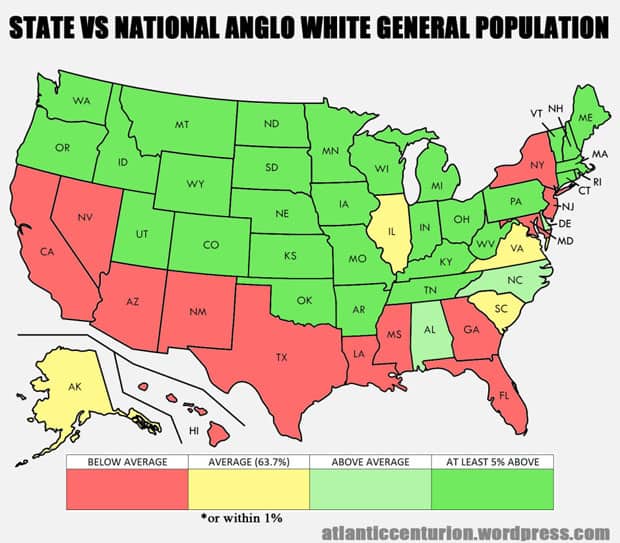
Here is how states’ White populations stack up to the national White population, which was 63.7% last Census (and by now is probably almost 60%). At 56.4%, Florida is below average, while at 92.3%, New Hampshire is above.
The blackest of demographic blackpills is that in pretty much every state the share of White births is typically double digits beneath that of the adult White population. So if you live in a state like 76.4% White Rhode Island, in a few years you might feel like you see a lot more non-white children then there should be, because only 59.7% of births were to White couples.
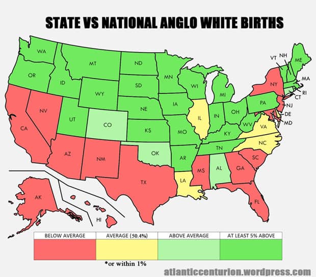
Here is how states’ White births stack up to national White births, which was 50.4% last Census, and widely reported a couple of years ago to have dipped under half. At 43.6%, New Jersey is below average, while at 63.7%, Tennessee is above average
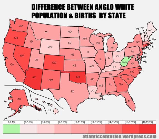
This map shows the gap between the White population and White births in each state. As you can see, literally only one state has more White births than general White population. That state is backcountry West Virginia, where a 93.2% White population has 95.2% White births, both of which are hugely above the national average as shown in the earlier maps. Other states have have been hit much harder for a variety of reasons, but mostly because the “breeding” age population is less White than the general population, especially in the newer immigration magnet states. So for example, the change is actually greater in places like Oklahoma (-19.5%) or Connecticut (-17.1%) than somewhere you might expect like Texas (-10.3%) or New York (-13.9%), as immigration from the third world is reaching more and more states.
{snip}