The Case of the Missing White Voters, Revisited
Sean Trende, Real Clear Politics, June 21, 2013
With a cloture vote on the Senate’s immigration reform bill expected next week, countless commentators have expressed the view that if Republicans don’t sign on for reform, the party is doomed at the presidential level for a generation.
This is the first in a two-part series explaining why this conventional wisdom is incorrect. Signing on to a comprehensive immigration package is probably part of one way for Republicans to form a winning coalition at the presidential level, but it isn’t the only way (for more, I’ve written a book about this, as well as countless articles here at RCP). Today I’ll re-examine what was really the most salient demographic change in 2012: The drop-off in white voters. Next time, we’ll confront some of the assumptions embedded in the “GOP has to do this” argument head-on.
{snip}
1. The most salient demographic change from 2008 to 2012 was the drop in white voters.
Let’s start with the basics: Just what were the demographic changes in that four-year span? {snip}
Using the most commonly accepted exit-poll numbers about the 2008 electorate*, we can roughly calculate the number of voters of each racial group who cast ballots that year. Using census estimates, we can also conclude that all of these categories should have increased naturally from 2008 to 2012, due to population growth.
From mid-2008 to mid-2012, the census estimates that the number of whites of voting age increased by 3 million. If we assume that these “new” voters would vote at a 55 percent rate, we calculate that the total number of white votes cast should have increased by about 1.6 million between 2008 and 2012.
The following table summarizes these estimates for all racial groups, and compares the results to actual turnout.

Now, the raw exit-poll data haven’t come out yet, so we can’t calculate the 2012 data to tenths: The white vote for 2012 could have been anywhere between 71.5 percent of the vote or 72.4 percent (with 26,000 respondents, analysis to tenths is very meaningful). So the final answer is that there were 6.1 million fewer white voters in 2012 than we’d have expected, give or take a million.**
The Current Population Survey data roughly confirm this. As I noted earlier, if you correct the CPS data to account for over-response bias, it shows there were likely 5 million fewer whites in 2012 than in 2008. When you account for expected growth, we’d find 6.5 million fewer whites than a population projection would anticipate.
This is the real ballgame regarding demographic change in 2012. If these white voters had decided to vote, the racial breakdown of the electorate would have been 73.6 percent white, 12.5 percent black, 9.5 percent Hispanic and 2.4 percent Asian–almost identical to the 2008 numbers.
2. These voters were largely downscale, Northern, rural whites. In other words, H. Ross Perot voters.
Those totals are a bit more precise and certain (and lower) than my estimates from November of last year. With more complete data, we can now get a better handle regarding just who these missing white voters were.
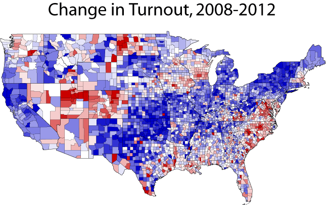
Below is a map of change in turnout by county, from 2008 to 2012. Each shade of blue means that turnout was progressively lower in a county, although I stopped coding at -10 percent. Similarly, every shade of red means that turnout was progressively higher, to a maximum of +10 percent.
The drop in turnout occurs in a rough diagonal, stretching from northern Maine, across upstate New York (perhaps surprisingly, turnout in post-Sandy New York City dropped off relatively little), and down into New Mexico. Michigan and the non-swing state, non-Mormon Mountain West also stand out. Note also that turnout is surprisingly stable in the Deep South; Romney’s problem was not with the Republican base or evangelicals (who constituted a larger share of the electorate than they did in 2004).
For those with long memories, this stands out as the heart of the “Perot coalition.” That coalition was strongest with secular, blue-collar, often rural voters who were turned off by Bill Clinton’s perceived liberalism and George H.W. Bush’s elitism. They were largely concentrated in the North and Mountain West: Perot’s worst 10 national showings occurred in Southern and border states. His best showings? Maine, Alaska, Utah, Idaho, Kansas, Nevada, Montana, Wyoming, Oregon and Minnesota.
We can flesh this out a bit more by running a regression analysis, which enables us to isolate the effects of particular variables while holding other variables constant.*** We’ll use county-level data, which is granular enough that we can feel more comfortable that we avoided ecological fallacy problems. You can see the overall results here. Almost all of the variables are significant; only the population density variable is of no value.****
For those who didn’t click over to the chart, we’re pretty confident that the voters were more likely to stay home if they resided in states that were hit by Hurricane Sandy, that were targeted by a campaign in 2008, that had higher foreign-born populations, and that had more Hispanic residents. The latter result probably suggests a drop-off in rural Hispanic voters, who are overrepresented in an analysis such as this one.
We’re also pretty confident that the voters were more likely to turn out if they resided in counties with higher median household incomes, high population growth, a competitive Senate race in 2012, or that were a target state in 2012. {snip}
Perhaps most intriguingly, even after all of these controls are in place, the county’s vote for Ross Perot in 1992 comes back statistically significant, and suggests that a higher vote for Perot in a county did, in fact, correlate with a drop-off in voter turnout in 2012.
What does that tell us about these voters? As I noted, they tended to be downscale, blue-collar whites. They weren’t evangelicals; Ross Perot was pro-choice, in favor of gay rights, and in favor of some gun control. You probably didn’t know that, though, and neither did most voters, because that’s not what his campaign was about.
His campaign was focused on his fiercely populist stance on economics. {snip}
3. These voters were not enough to cost Romney the election, standing alone.
But while this was the most salient demographic change, it was probably not, standing alone, enough to swing the election to Obama. After all, he won the election by almost exactly 5 million votes. If we assume there were 6.5 million “missing” white voters, than means that Romney would have had to win almost 90 percent of their votes to win the election.
Give that whites overall broke roughly 60-40 for Romney, this seems unlikely. {snip}
{snip}
—
* Ruy Teixeira has mostly convinced me that the correct final exit numbers for 2008 were 74.3 percent white, 12.6 percent black, 8.5 percent Hispanic, 2 percent Asian and 2.6 percent “other.”
**I also note that Hispanic participation probably exceeded projections when you consider that a disproportionate chunk of the Latino population growth consists of non-citizens who are therefore ineligible to vote. Also note the disproportionately large drop-off in “other”; I suspect this is mostly a function of the “rounding issue” I describe above.
***As my independent variable, I used the percentage change in turnout in each county from 2008 to 2012. Since we have over 3,000 observations using this technique, we can run a large number of variables. I went with 13. Five of them were meant to control for basic external effects: population growth, whether the county was in a state targeted in 2008 or 2012, whether it was in a state affected by Hurricane Sandy, whether there was a competitive Senate race in 2012 (the states that had competitive Senate races in 2008 were almost all swing states).
I ran a variety of demographic controls: the percentage of the county that was above age 65, that was African-American, that was foreign-born, and that was Mormon. I also included population density and median household income.
Finally, I included the percentage of the vote cast for Ross Perot in 1992.
**** The r-square is a bit low at 0.3, but we’re trying to explain a vast amount of data that probably relied on thousands of variables (local weather, differing amounts of money spent, other statewide contests). Moreover, a lot of these counties are so small that “quantum effects” — random individual decisions — can start to skew things. An extended family afflicted with food poisoning at Sunday dinner can materially affect turnout in some counties in western Kansas. If you exclude the 29 worst outliers (in geek speak, the ones whose standardized residuals exceed 3), the r-square jumps to 0.4.

