A Harsh New Light on Race and Murder
Jared Taylor, American Renaissance, March 24, 2023
An amateur number-cruncher’s remarkable findings.
Thumbnail credit: © Maria Leon/EFE via ZUMA Press
This video is available on Rumble, BitChute, and Odysee.
My organization, American Renaissance, has been studying race and crime ever since 1990. We published our first report called “The Color of Crime” in 1999, and updated it in 2005 and 2016.
I am therefore very happy to find that an amateur researcher, working in his spare time, has looked even deeper than we ever did into the racial aspects of the most serious crime of all: murder. This person, whose name I don’t even know, tweets under the name of datahazard.

He also has a Substack that, as you can see, is about “advocacy and analyses on underreported & unpopular topics.”

I have not checked all his data. That would take weeks. But what I have checked is accurate, and his conclusions and assumptions are reasonable. I’ll call him Datahazard.
This is one of his most powerful tables. These are the rates at which blacks, whites, and Hispanics – of both sexes – committed murder in 2021. Please look at the highlighted column, white male, murderers per 100,000.
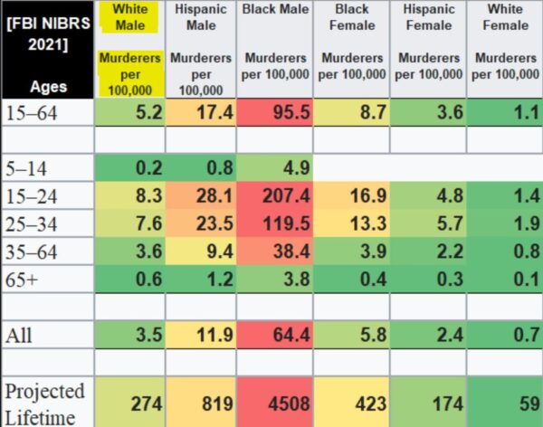
This is the rate at which white men committed murder at various ages. The figure just below the yellow highlight is 5.2 per 100,000, the rate at which everyone between the ages of 15 and 64 committed murder. Below that are murder rates for various age groups. As you can see, for white males ages five through 14, the number is 0.2 per 100,000, which means that only one in 500,000 white boys that age killed anyone in 2021. The murder rate jumped to its highest for the 15 to 24 age group, and then tailed off as the men got older.
Now, look at the column for black male, murderers per 100,000.
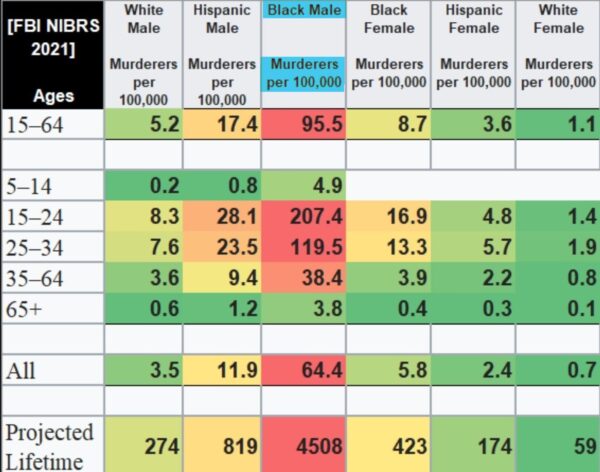
As you can see, the rates for every age group are much higher than for white males. Look at the number for black males of all ages, in the row next to the bottom. That figure of 64.4 is 18.4 times higher than the equivalent figure of 3.5 for white males. In 2021, any given black man was 18.4 times more likely than any given white man to commit murder. You almost never get such a huge difference when you compare human groups of the same sex living the same country.
Now look at Hispanic males.
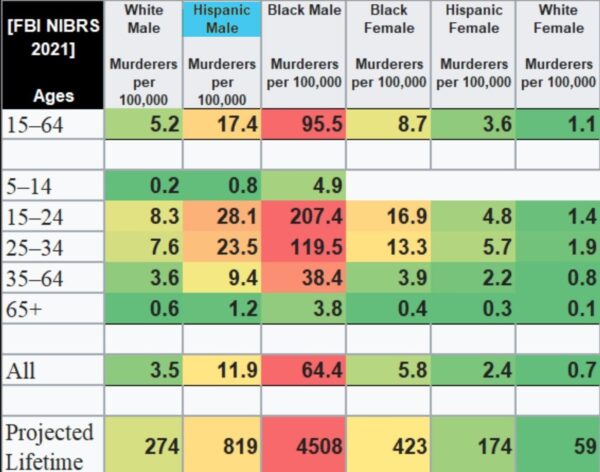
As you can see, their murder rates were consistently higher than white murder rates – 3.4 times higher for males of all ages – but a lot lower than for blacks. These data are consistent with findings I have reported elsewhere. But Datahazard has gone further.
Look at the murder rates for black females.
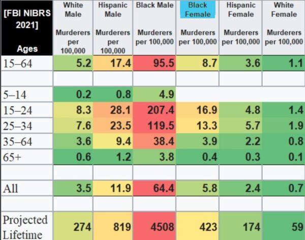
In 2021, no black girl under 14 killed anyone, but older women made up for it, and when you look at the figure down below for all ages, black women were 65 percent more likely than white men to commit murder. This is another remarkable finding. Women of all races are less violent than men of the same race, but I have never seen a breakdown of the data to show that in any year, black women were more likely than white men to kill someone. The data on Hispanic and white women are what you would expect. Hispanic murder rates are in between white and black rates, and white women were the least likely group to kill anyone. If Datahazard had included Asians, they would be the least homicidal race.
But what’s the meaning of the last row of data, “projected lifetime”?
This is the rate, per 100,000, for a person of each group to commit murder during his entire lifetime. Remember, everything else you see on this table is a snapshot for a single year, 2021.
Look at the black male murder rate of 207.4 per 100,000 for people in the age group 15 to 24.

A black man is going to stay in that very murder-prone age group for 10 years. Every black man is going to spend every year of his life as a member of the race and sex that is the most likely of any in America to commit murder. What Datahazard therefore calculates as “projected lifetime” is the rate per 100,000 for a black male – or someone of any of the other groups – to kill someone over the course of his entire life, if the murder rates for 2021 continue on into the future. For blacks, that figure, at the bottom of the table, comes out to 4,508 per 100,000, and expressed as a percentage, that’s 4.5 percent. If the black male murder rate for all age groups remains at the 2021 rate, we can expect that 4.5 percent of black men – about one in 22 – would eventually kill someone. For white men, in the lower left, it would be 0.27 percent, or about one 17th the black rate. For white women, the number is 0.059 percent.
Actually, these are theoretical maximums. They assume each murderer kills just one person, and we know that some murderers kill more than once. Datahazard concludes that if you made the most extreme assumptions about murderers who kill more than one person, you could bring the lifetime likelihood that a black man will commit murder down to no less than 3.3 percent, but for various reason he explains at his substack, he thinks the correct number would be around 4 percent or, that at 2021 rates, one in every 25 black men will kill at some point during his life. For white men the number would be about one in 425.
One in 25 versus one in 425. That’s a huge difference. When do you think you will see a table like this on the evening news or in the New York Times? Or at a congressional hearing?
Here is another one of Datahazard’s remarkable graphs.
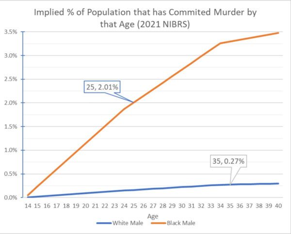
This shows what percentage of black males (the orange line) and white males (the blue line) will, statistically, commit murder by a particular age if the 2021 rates remain unchanged. Age is on the horizontal axis, starting at 14. Just about nobody has killed anyone by that age. But as you can see, by age 15, a quarter of a percent of black boys have killed someone – that’s one in 400. By age 25 on the orange line, just over 2 percent, or one in 50 have killed someone. For both races, the percentage climbs sharply up to about age 35 and begins to level off. If Hispanics were on this graph, they would be somewhere between blacks and whites. Asians would be way at the bottom.
Murder rates in 2021 – and they were higher in 2022 – may seem high now, but there have been much worse times. In this graph, Datahazard uses the blue line to show yearly changes in the black male victimization rates – the rates per 100,000 at which black men were murdered – almost always by other black men.

The orange line is accumulated deaths by murder of black men with a six-year projection after 2021. The point is, black rates of death by murder have been a lot higher in the past. Sixty percent higher in 1972, and 33 percent higher in 1991 — compared to 2021.
Here are more interesting historical data.
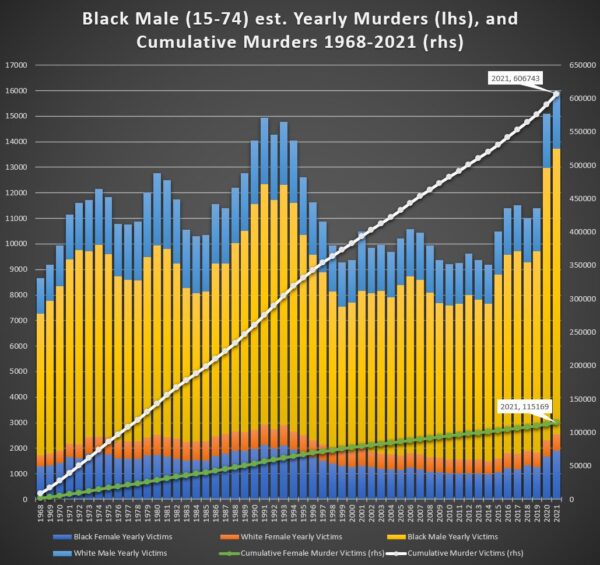
Datahazard has found that between 1968 and 2021, 1,084,990 Americans were murdered, including blacks and whites. Blacks killed 56 percent of them, even though during that time there have been approximately five times as many whites as blacks. Here, the left-hand axis is the number of murder victims of blacks for every year, just under 9,000 in 1968, rising to 16,000 in 2021.
Please look at the colors of the vertical bars. The blue section at the bottom is the number of black women killed by black men that year, and the orange section is white women killed by black men that year. The big yellow section in the middle is black men killed by black men – there are a lot – and the blue section at the top is white men killed by black men. Over on the left, you can see that in 1968, black men killed about 430 white women – the orange bar second from the bottom – and about 1,400 white men, shown by the blue bar at the top. (More precise figures in the next graph.) In 2021, over on the right, you can see that black men killed about 2,800 white men and about about 650 white women (the units are still on the left axis). These are estimates for some years, but Datahazard seems to be a careful guy who makes conservative estimates.
The white line is the accumulated death toll of victims of black men from 1968 to 2021, which is to say, 606,743, with the units on the right axis. The green line is the total number of women killed by black men during that period, or 115,169.
Datahazard does not shy away from the touchy issue of interracial murder. In the left-hand part of the graph are estimates of the numbers of whites killed by blacks, from 1968 at the bottom, to 2021 at the top.
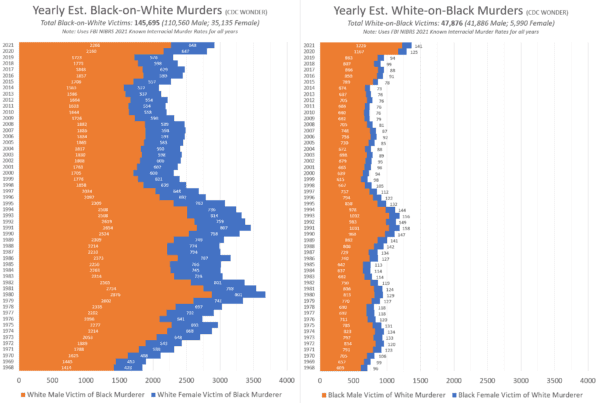
Orange is white men they killed and blue is white women they killed. Datahazard estimates a total of 145,695 white people – including 35,000 women – killed by blacks in the last 53 years. Just for comparison, that’s more than the 117,000 American soldiers killed in the First World War.
Over on the right are estimates of white-on-black murders, again with men in orange and women in blue, for a total of 47,876 blacks killed by whites. Given that there are about five times as many whites as blacks in the country, a black was about 17 times more likely to kill a white than the other way around. But it’s worse than that, because as Datahazard points out, for most historical data, the government stupidly lumps Hispanics in with whites, so that in these graphs, “whites” includes whites and Hispanics.
As we saw earlier, when you can separate Hispanics from whites, they are three-to-four times more likely than whites to commit murder, and they are more likely to live close to black and to kill blacks. My guess is that the odds of a black killing a non-Hispanic white rather than the other way around are well over 20 times greater.
This is the total of the excess of black-on-white killings over white-on-black killings from 1968 to 2020.
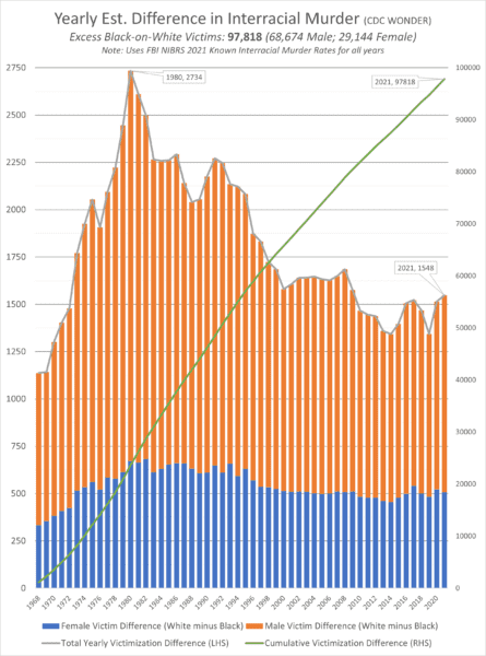
In other words, white-on-black murders are subtracted from the much larger number of black-on-white murders. Again, excess female deaths are in blue and excess male deaths are in orange. The green line is the cumulative total. Datahazard finds that during that period, blacks killed nearly 98,000 more whites (including Hispanics) than whites (including Hispanics) killed blacks.
There are plenty more interesting graphs from Datahazard. Here is one of how black and white men die violent deaths, blacks on the left, whites on the right.
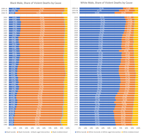
The colors mean the same things for both races. Blue on the left is suicide, orange is homicide, the tiny grey sliver is killings by police, and yellow means cause unknown. The data go from 1968 only up to 2016, which is too bad, but in that most recent year, you can see that about 75 percent of black men who die violently are murdered, whereas 75 percent of whites who die violently kill themselves. Again, the number killed by the police is tiny, and is about the same percentage for both blacks and whites. The police are not, and never have been, on the prowl, looking for black people to kill.
Do you remember this graph that shows changes in the rate at which black men were murdered, year to year?
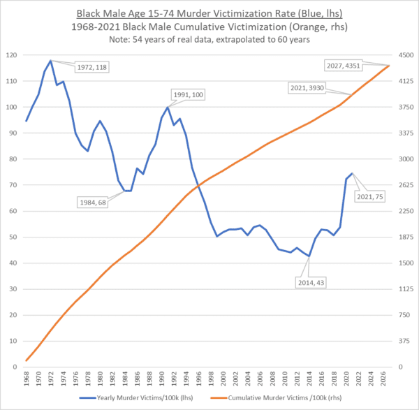
Please note the peak in 1991 and then the decline to 2014. Essentially all crime followed this pattern, rising to the early ’90s and then dropping. Here is a graph from a different source of total crime rates – the dark blue line – plotted against the incarceration rate.
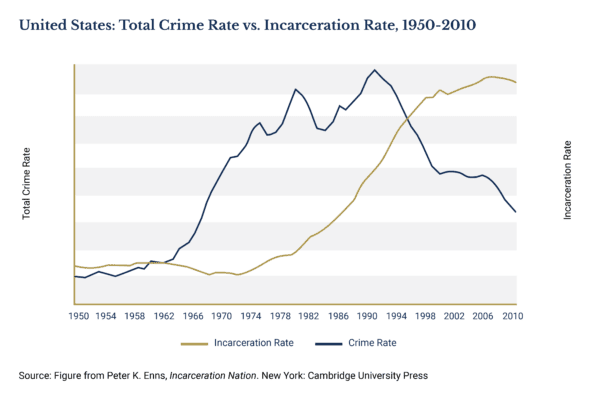
See the peak for the total crime rate in the early ’90s, that then declines towards the 2010s? Do you think rising incarceration rates – the rising gold line – had anything to do with it? Of course, it did. If this graph continued into the present, you would see that incarceration rates have been falling while crime rates rise. We have DAs who won’t prosecute, the elimination of bail, hatred for and defunding of police, and don’t forget the big Covid convict release because prisoners might infect each other.
Lefties tie themselves into knots trying to convince you prison is not the solution, but a guy who is locked up can’t kill or rob you, can he? We occasionally get hints of this, at least in foreign newspapers: “’Keep violent people in jail’: Washington DC police chief says average homicide suspect has ELEVEN prior arrests before committing a murder – as crime rates surge.”

As the chief says, “When they’re in jail, they can’t be in communities shooting people.” What an idea. But, as you know, we are governed by “woke” morons who are determined to disbelieve even a black police chief.

And so, even though “black lives matter” might as well be the new state religion, black people will go on killing each other – and us – so long as people with 11 prior arrests are walking around rather than living in the big house.
We are not governed exclusively by morons. We are also governed by ignoramuses. Our rulers don’t know a tenth of what I have just told you, and I haven’t covered a tenth of what Datahazard can tell you.
But I’ll add just one thing. Here is how the racial mix of the United States is changing.
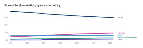
Whites, the top line, were almost 70 percent of the population in 1990, and we were just under 60 percent in 2021. If the country in 2021 had been 100 percent white, and the white murder rate were the same as it was in 2021, the number of murders would have dropped from about 26,000 to about 7,000 – a decrease of 73 percent. The approximately 40 percent of the population that is black and Hispanics, means we have nearly four times as many murders as an all-white country would have. Just something to think about.
Of course, our rulers are not thinking about that. And nothing will change until Americans realize that we wouldn’t have anything like the crime problem we have if we didn’t have a race problem.