This World Map Shows the Enormity of America’s Prison Problem
Michael Kelley and Christina Sterbenz, Business Insider, January 24, 2014
About 2.4 million people live behind bars in America — the highest number in the world. That’s a little more than 0.7% of the population and more than 700 for every 100,000 people.
This world map illustrates how disconcerting that is.
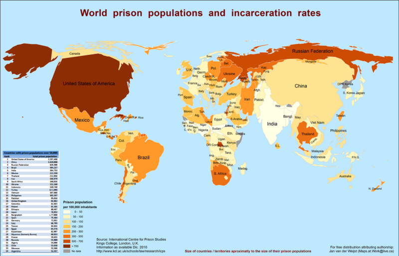
Click to enlarge.
The size of each country corresponds to the size of its total prison population (as of 2010), and a darker color indicates a higher incarceration rate. The area of the U.S. is bigger than China, a country that dwarfs the U.S. general population by more than four times. Also note how tiny Canada looks next to the U.S.
Compare that map to one which uses data from the International Centre for Prison Studies to show the number of prisoners per 100,000 citizens (as of October 2012). The data hasn’t changed much, and this map focuses on the incarceration rates without factoring in the total prison population.
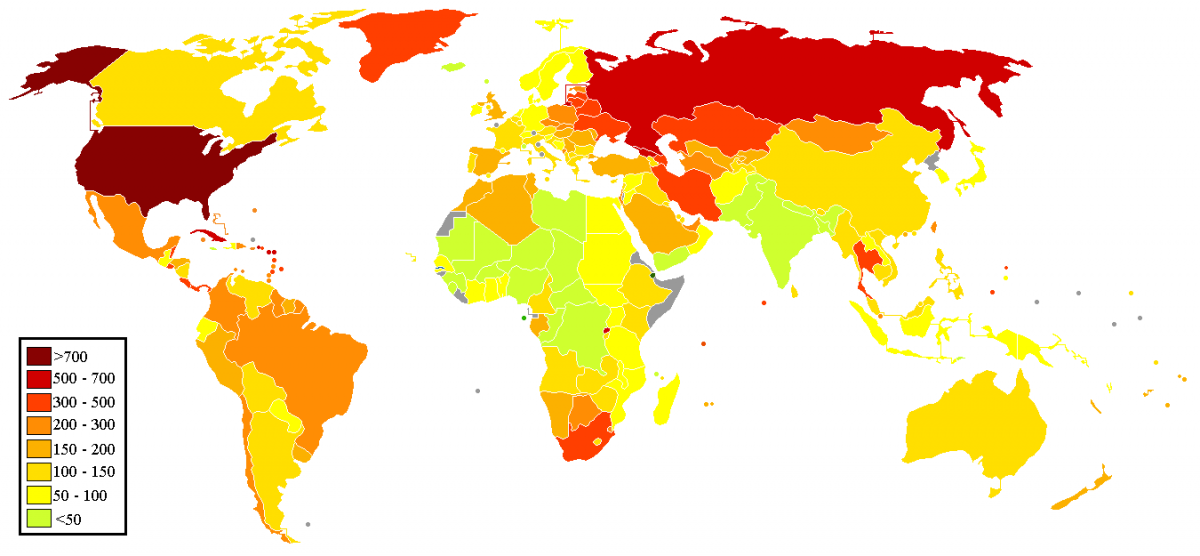
Click to enlarge.
{snip}